Chick-fil-A Billboard Advertisements

Chick-fil-A has risen to one of the most popular restaurants in North America. This restaurant has made a name for itself in less than a century and built a distinguished brand that fast food consumers will adore for generations.
Started by S. Truett Cathy in 1946, Chick-fil-A began humbly, providing the best Original Chicken Sandwich six days a week at the Dwarf Grill. A family business that became one of the most successful fast-food restaurants today.
Two vital parts created such success so fast: the marketing and the service. The food and service make Chick-fil-A what it is and encourage customers to return, but Chick-fil-A’s marketing, branding, and advertising spread the name and get people in the door.
Marketing Strategies For Success
Steve Robinson, the chief marketing officer for Chick-fil-A, was struggling along with the business. While it was growing, it was not making money; it needed to be a success. Having just lost 2 million dollars and facing competition from the burger giant McDonald’s, who entered the chicken game, Robinson needed something big.
But the increasing competition led to the Cow Campaign, which they first released in 1995. In a twisted version of “if you can’t beat them, join them,” the competitor’s primary product became the mascot of Chick-fil-A. Who would not be amused with rebel cows?
Cows became an integral part of the company, strengthening its brand identity as the best chicken sandwich. These cows paved the way for the Chick-fil-A we know today.
Why Did Billboards Do So Much for Chick-fil-A?
Chick-fil-A uses more than just billboards to advertise. While there is an abundance of social media, TV advertising, and even super bowl commercials now, when this campaign started, a billboard was the way to grasp attention.
Chick-fil-A billboard advertisements are built on OOH advertising (Out Of Home ads). They cultivate brand awareness and bring the public information about the restaurant. Every billboard Chick-fil-A put up with a catchy saying strong enough to stick in people’s brains long enough for people to remember the brand when ready for their next meal.
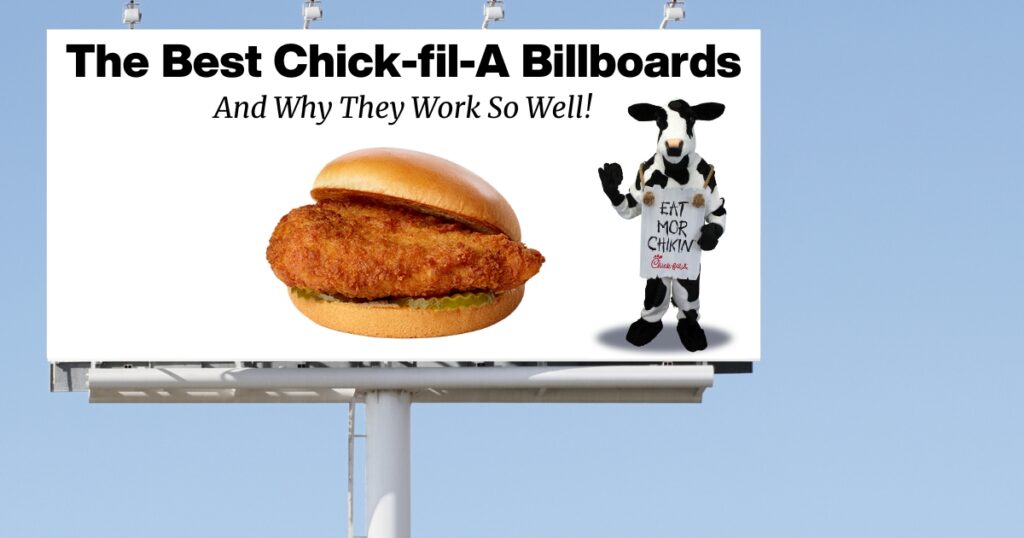
The original “Eat Mor Chikin” billboard became recognizable, and soon the font, cows, and misspelled words became a hallmark of Chick-fil-A. Conveniently placed on busy highways, every billboard made Chick-fil-A such a well-known name.
The Cow Campaign
The success behind Chick-fil-A billboards is primarily because of the Holstein cows and the Chick-fil-A cow campaign. This campaign used mostly OOH ads, such as water towers and stadiums, as well as their popular billboard design. Each of these ads combines a humorous saying with rebel cows, encouraging the public to eat chicken to save cows.
Each of the cows in every TV ad and outdoor advertising throughout the campaign is based on Cowboy Phil’s Holstein cows. Cowboy Phil and his cows worked with Chick-fil-A for over twenty years to create a brand centered on these ideas.
Throughout this campaign, more than a few billboards did exceedingly well. By using their biggest competitors’ most popular product, Chick-fil-A found a simple way to succeed by doing less. Here are a few of the most successful billboards that Chick-fil-A launched through the Cow Campaign.
“Eat Mor Chikin”
The entire cow campaign started with a single billboard with three simple words “Eat Mor Chikin.” Playing off the idea of “dumb cows” who could not write well, the words are misspelled, and the paint is sloppy.
This message encouraged anyone who saw it to empathize with the two rebel Holstein cows. Chicken was a minority amongst fast-food restaurants that primarily served beef, and Chick-fil-A needed to highlight that their difference was better.
“Try Grilled Chikin, Itz Smokin”
After the initial success, the rebel cow billboards became the talk of marketing. With new menu items came new billboards. When Chick-fil-A started advertising their grilled chicken sandwich, they decided it was time to let the cows play with fire.
This billboard featured cows with fire extinguishers, firefighter gear, and fake flames that were grilled much like the chicken. Since rebel cows were funny, relatable, and grabbed attention, the marketing team ran with it.
This led to many simple sayings with the same sloppy writing, but they delved into using these cows to their fullest extent.
“If it’s not Chick-Fil-A, it’s a joke.”
One of the first billboards by Steve Robinson, the “If it’s not Chick-fil-A, it’s a joke,” was a major flop. However, this flop led to the “Eat Mor Chikin.” The original design was meant to be a joke with the rubber chicken, often in comedy skits partnered with the word joke.
But people did not get it and did not think it was funny, though it drew attention. This billboard may not be the best of Chick-fil-A, but it is one of the essential pieces of ad design that helped make the brand what it is today.
The intent was to create a standard that matched that of the restaurant and its owners. They presented a paradox for a humorous but somehow still serious billboard that simultaneously was credible but funny.
“Our Happiness Yer Chikin Eating”
As the cow campaign continued to rise, more plays of the original came out. This board compares the cow’s happiness to people eating chicken. The marketing team continued to run off the cows and their shaky, misspelled letters.
They created this billboard hoping to present something funny along with a made-up statistical graph. This graph also matched the restaurant sales, which were going up and leaving the red.
“Burgerz R 4 Losers I’M Just Sayin”
This billboard meshes well with others in the campaign because of the matching solid white background and placing the cows, which would not change positions till later.
This billboard called out their competition without having to name names. The designers wanted this to be simple and pointed, hence the blank background. The billboard slogans played off common sayings, such as calling the opposition a loser.
“Beef Puts U 2 Sleep”
While beef puts you to sleep is not the most brilliant play on words, Chick-fil-A used this billboard more to showcase the rebel cows passed out. There are three cows instead of the typical two, and the color of the wording changes slightly to navy blue from the trademarked black.
Like turkey, beef contains tryptophan which can cause a sleepy feeling. Advertisers thought this would showcase chicken as energizing and more healthy. This, with how Chick-fil-A cooks chicken, makes it a healthier choice than the other competition.
“All Roads Lead to Chikin”
This billboard plays on the well-known proverb “all roads lead to Rome,” connecting a common phrase with their branding. This billboard is one of the more recent ones because the cows are printouts and not three-dimensional, and there are directions on the bottom of the billboard with the logo.
The people who designed this board wanted to give clear directions by using the roads, which is referenced in the wording. It is a simple message that leads people to drive straight to Chick-fil-A.
Final Thoughts
Chick-fil-A is the third most revenue-earning fast-food chain in the U.S., behind only Starbucks and McDonald’s, despite having significantly fewer locations than them. As a Christian company, Chick-fil-A’s unwillingness to compromise on their faith forces them to be extremely strategic in their business approach, and it’s working very well for the brand.
About Us
805 SEO is a part of the Equipping Entrepreneurs family offering search engine optimization, website development, and lead generation services. We serve the entire United States but have local SEO services in Houston TX and Ventura CA.
